PerfectThings UI
Today, we have the pleasure of presenting to you the latest iteration of our UI framework. The version number is 8.0, and it has tons of upgrades, but also some breaking changes. But first:
What's that all about?
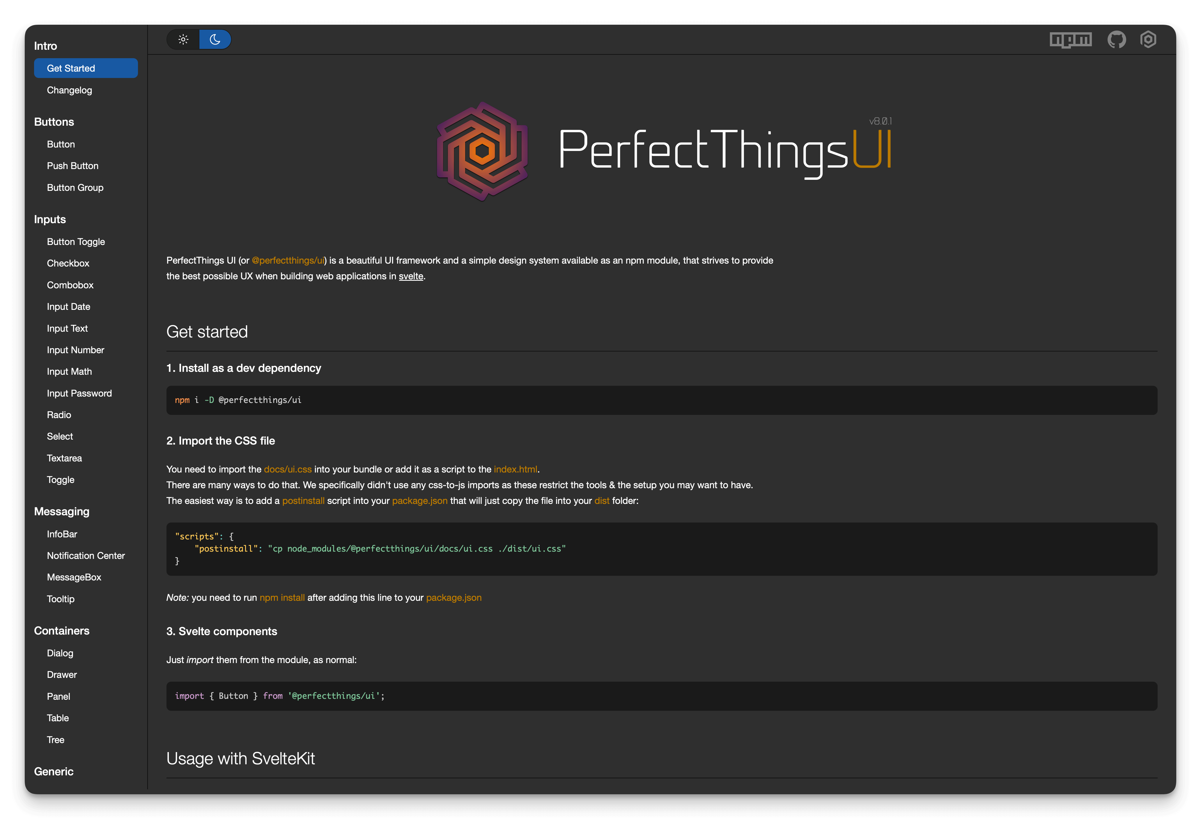
PerfectThings UI (or @perfectthings/ui) is a UI framework available as an npm module (for the JavaScript ecosystem), that strives to provide the best possible UX when building web applications in svelte.
UX, DX, QA
The main focus of the framework design and architecture is the User eXperience (UX). That includes superior usability and accessibility, but also flexibility and the ease of use of the framework itself, and so-called developer experience (DX). All components are easily extensible, stylable and configurable.
We have put a lot of attention to the smallest details, and pixel-perfect recreation of the designs. We have also done our best to retain the high standards of code quality and technical design, and we took no compromises in doing so, sometimes spending weeks perfecting that jagged animation or leaking background (due to browser's rendering issues). And with the latest version, components are even more robust and versatile. And they are also being battle-tested in our soon-to-be-released secret application.
Accessibility
Yes, we took the time not only to write the full word (instead of the lazy a11y) but most importantly, we took the time to make every component fully accessible.
Most components (especially the inputs) are built with the native HTML elements inside, and only add a layer of additional functionality and style. The ones that don’t extend the native elements, have been designed with accessibility in mind: all have the necessary role and aria- attributes and are fully usable with or without the mouse.
The colour palette was also designed to not only look good, but to present the content with the minimum contrast levels that reach the AAA grade of the WAI-ARIA standard.
The framework also respects prefers-reduced-motion preference and will disable all animations in this case.
Dependencies
The framework has only two dependencies: vanillajs-datepicker that powers the InputDate component and the optional zxcvbn package from Dropbox, that allows for password strength checking in our InputPassword. The zxcvbn library can be omitted by the consumer, in which case password strength will just be disabled, but the component will still work otherwise.
Latest iteration
With version 7.x as well as 8.x, all input controls have been redesigned to provide a unified and consistent API. All inputs can now show errors and additional information using the new attributes: label, error and info.
All controls (with the exceptions of two) expose element property that points to the outermost HTML element of the component, which the consumer can bind to a variable.
Input controls, additionally expose inputElement that points directly to the underlying input element. You can see more details on this in our changelog.
Member discussion